
Table of Content
Introduction
What “Feels Expensive” Really Means on a Website?
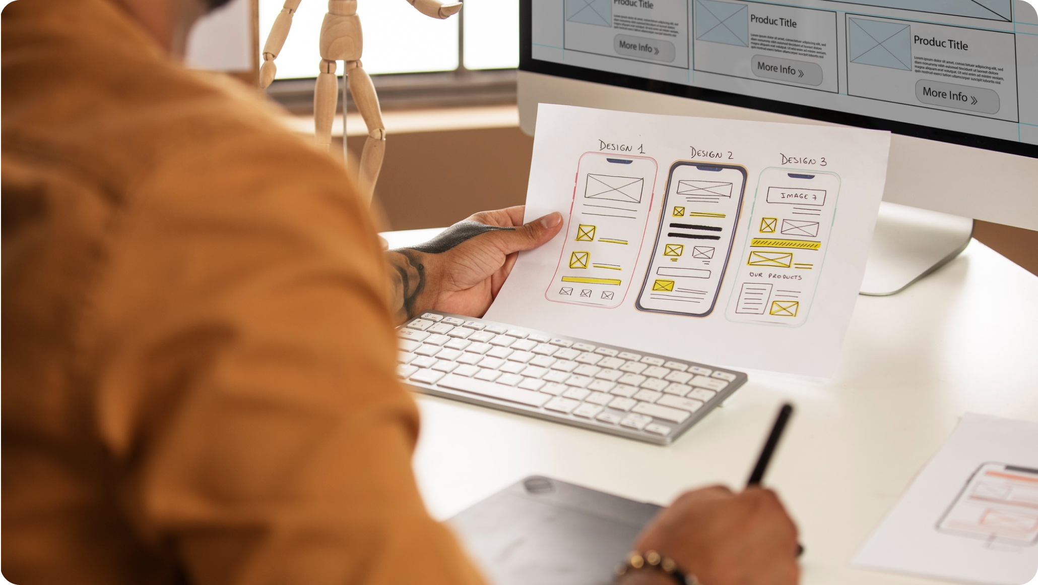
Layout and Spacing: The Quiet Signal of Premium Quality
Typography: How Fonts Decide Your Brand’s Status
Color and Contrast: Premium Brands Don’t Overdecorate
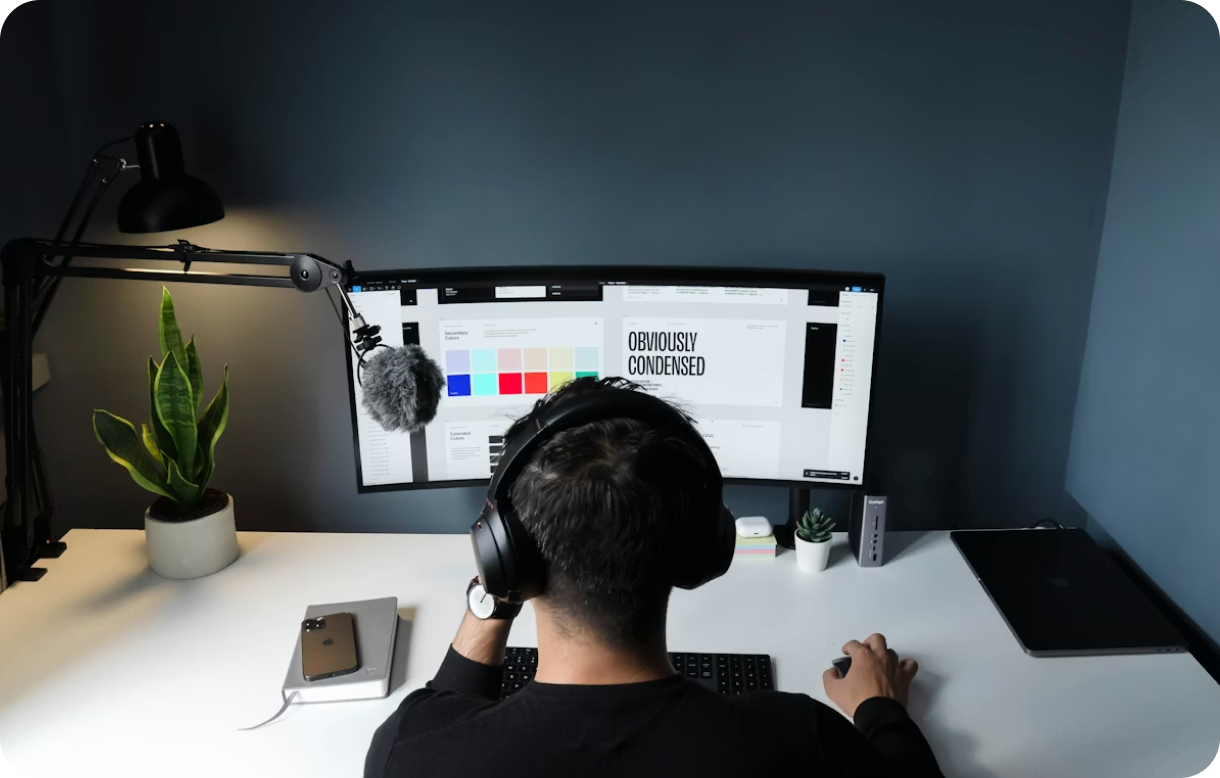
Imagery and Visual Style: Real Brands Don’t Look Like Stock Templates
Micro-Details: The Small Things That Make People Trust You
Content Structure: Premium Websites Feel Clear, Not Long
Conclusion
A website can look “nice” and still not feel expensive. And a website can be simple, even minimal, but still feel premium the moment you land on it. That feeling is not luck. It comes from small design choices that quietly tell your brain, “This brand knows what it is doing.”
In 2026, people judge faster than ever. They open a site, scroll for five seconds, and decide if they trust you. They decide if you are serious. They decide if your pricing will be reasonable, or if it will feel risky. That is why expensive website design is not only about beauty. It is about signals. It is about quality, credibility, and maturity, shown through visuals.
A website that feels expensive uses signs of order, confidence, and restraint. Premium brands keep their designs simple. They stay in control of all design elements. They space everything appropriately, keep calm typography, consistent visuals, and have clear, sharp messaging.
All the mature brands know how to be subtle and not oversell with a lot of focus on the first scroll. They present the information in the right order and let the quality do the selling. This will create trust.
People may think the business is also messy if your website is unorganized, inconsistent, and unclear. Excellent service will not save you if your design is bad. This is why the right visual cues are important, especially for first-time visitors.
The important factor that changes a website's appearance without changing any of the content is giving the content space. It is noticeable when a website looks more expensive when the is space between the text, the larger buttons, the sections, and the headings. Overall, a website that looks expensive has a very calming feeling and looks like it has been put together well.
The more space that the website has, the more able people will be able to scan the content which will make it look like it has been designed by an actual designer instead of it being designed by a website that just put the content into the website without thought.
One of the best things that can be done to show that a website is expensive is to improve the spacing, very simple, and clean. It shows that a lot of care has gone into making the website and that it has been planned well. A clean and simple layout shows that the designer has applied and cared for the details which raises the credibility of the website.
Most people overlook typography, but it creates trust quickly. Competitor analysis shows that premium websites usually use one or two font families, not five. They use clear size hierarchy, not random heading sizes. They use concurrent letter spacing, clean line height, and strong contrast.
Good typography helps the website present itself as a polished product, not as a document. It will also elevate the perceived intelligence of the brand, even if the wording is simple.
Typography involves font pairing and font weights, and this is also an area that cheaper websites lack. Premium websites Bolded text is used more sparingly, they have a better use of negative space, and they use more font hierarchies. Cheaper websites use more generic fonts, more bolded text, and more negative space.
Weak typography will undermine even the best words, and the most underrated element of expensive website design is strong typography. It is one of the strongest visual credibility cues available.
A website that feels expensive usually has a controlled color system. It does not look like a rainbow. It does not use ten accent colors for no reason. It usually sticks to a small palette, with one accent color that is used carefully.
Premium design uses contrast well. Text is readable. Buttons stand out without screaming. Background shades are subtle. The site does not feel noisy.
Many websites try to look premium by adding gradients, glows, and fancy backgrounds everywhere. That often has the opposite effect. It makes the design feel like it is trying too hard. A mature website feels intentional, not decorative.
A clean palette and strong contrast are simple, but they instantly increase trust. People may not say it, but their brain reads it as professionalism. This is exactly what visual credibility cues are. They do their job quietly.
The visual consistency of premium websites is generally good. Styles should be consistent for photos, illustrations, or icons. Thus, nothing should seem mixed.
Cheap websites may feature a variety of mismatched stock images (many appear warm, many appear cold, many appear flat) which causes inconsistency and gives a brand an amateur appearance.
High-quality visuals do not necessarily require an expensive photograph shoot as they should complement your brand’s tone and the audiences' and layout. Composition, lighting and cropping of the images will also reflect on a good website; this includes where you place your images.
Additionally, premium websites do not utilize imagery in a decorative manner; they use images that help to convey the intended message. Using imagery in this way is an integral part of the luxurious feel of the website and is indicative of a company’s level of tastefulness and clarity.
Even when people don't consciously realize it, they pay attention to the "little things": smooth page scrolling, consistent card corner radius, clean card shadows, spacing within cards, how fields in forms look and behave, how loading states of your pages behave, etc.
Many websites fall short in this area. They may have a good overall layout but often, their small details feel inconsistent with each other. For example, you may have a button rounded on the corners next to a button that has sharp corners; you may have a card with shadow next to a card without shadow; you may have sections with one style of icon, and a next section with a different style of icon, etc. These types of inconsistencies convey a cheap feeling.
There is a common misperception that a more expensive website will have more content than a less expensive one. This is not necessarily the case although premium websites typically have less words than low-cost sites.
When designing the layout of the content on a premium website, it will be organized in such a way as to ensure that everything flows together from the initial headline, through the supporting text, and ultimately to the call to action without leaving the user feeling lost.
Also, a premium website will provide supporting evidence for claims at the appropriate time, and the call-to-action will be prominent without being overly forceful.
Conversely, low-cost websites tend to cram all their information onto a single page and hope to convince the user of the validity of their content by sheer volume. In contrast, premium websites aim to persuade users through clear and concise content.
A website that feels expensive is not about showing off. It is about making the visitor feel safe. Safe to trust you. Safe to pay you. Safe to contact you. Safe to take the next step.
The biggest visual cues that signal quality and maturity are not complicated. Clean spacing. Strong typography. Controlled color. Consistent visuals. Polished micro-details. Clear structure. Calm proof. When these pieces come together, your site feels like a brand that has grown up.
If you want an expensive website design that truly works, focus on removing noise and building consistency. When you do that, your website stops feeling like a page. It starts feeling like a real business with credibility. And that feeling is what converts.
Do you have a website you would like to audit?


If you’re wondering how to create a strong online presence for your business, let’s connect! Schedule a call with us, and we’ll guide you step by step—right from scratch—on how to design your brand, build your website, and establish a powerful digital presence that truly represents you.